This post may contain affiliate links.


At the beginning of a year, everything feels a little more open. Like a blank page waiting for intention. That’s usually when decorating feels less about fixing what’s wrong and more about choosing what feels right.
Decorating with your birthstone color makes that idea personal. It’s not about chasing trends or getting everything perfect. It’s about letting your space reflect who you are, something familiar, a little symbolic, and quietly meaningful. Whether it shows up as a feature wall or a small detail you notice every day, your birthstone color becomes a way of setting the tone for what’s ahead.
As an October baby, my birthstone is opal, and it makes sense in a way that’s hard to explain but easy to feel. Opal isn’t loud or fixed. It changes with the light, carrying hints of blush, pearl, and cool gray at once. Decorating with that color feels less like following a rule and more like honoring that in-between space where softness, depth, and quiet individuality can coexist. And instead of chasing trends, leaning into my birthstone color is a way to create a home that feels calm, layered, and unmistakably personal.
As James Mellan-Matulewicz, Creative Director at Bobbi Beck, puts it, “Decorating with birthstone colors isn’t about following a concept. It’s about having fun with color in a way that feels expressive and personal.”
Below is a month-by-month guide, pairing each birthstone with styling ideas that let color feel intentional without overwhelming your space.
January — Garnet Red
A rich, deep red
Garnet red brings warmth and depth, especially in smaller, more intimate spaces. It works beautifully in a snug, reading nook, bedroom, or dining area where the color can settle in and feel grounding. Dark wood furniture pairs naturally with this shade, adding richness without competing. Keep styling minimal and thoughtful so the color can hold the room on its own.

February — Amethyst
A calming purple with cool undertones
Amethyst feels composed and restful, making it ideal for bedrooms or home offices. Used as a statement wall, it brings quiet drama without heaviness. Balance the color with soft whites, pale blush tones, or gentle neutrals. Natural textures, linen, wool, and woven accents help keep the space feeling warm and lived-in.
March — Aquamarine
A fresh blue-green
Aquamarine has an easy, uplifting energy. It works well in spaces that need a little movement, like hallways or living areas. Pair it with black or gold accents to give the color structure and let its graphic qualities stand out without feeling busy.
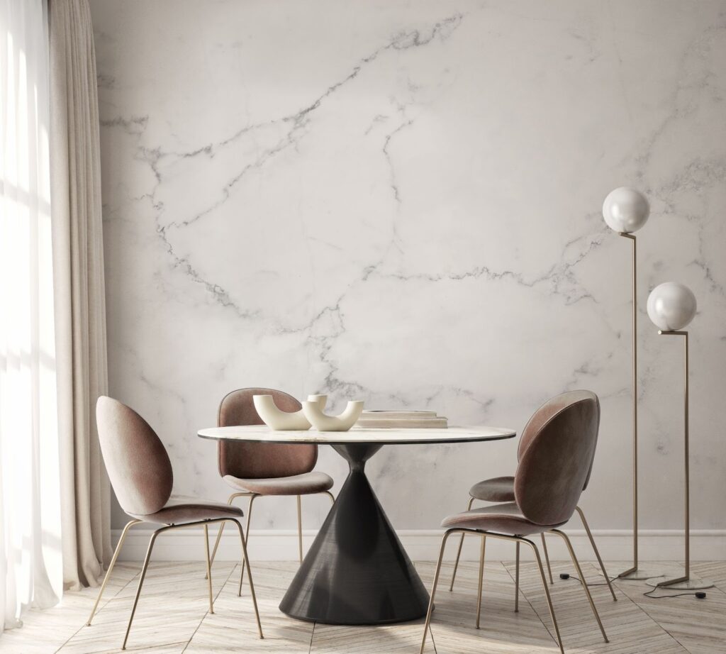
April — Diamond
A soft balance of warm white and pale grey
This shade is subtle in the best way. It adds texture and light without demanding attention, making it a natural choice for any room where calm matters most. It pairs easily with light woods and warm neutrals, while layered fabrics add softness and dimension.
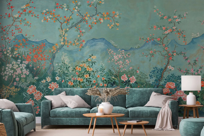
May — Emerald
A deep, luxurious green
Emerald brings confidence to a room. It works best where natural light can play off its depth—living rooms, dining spaces, or statement areas. Lean into its richness with velvet textures in jewel tones and darker wood finishes. A touch of brushed brass or gold adds just enough polish.
June — Pearl
A soft, luminous off-white
Pearl tones create a welcoming backdrop that feels both fresh and timeless. Ideal for open-plan spaces, dining rooms, or living areas, this shade reflects light beautifully. Pair it with blush tones, warm taupe, or gentle lighting to keep the room feeling relaxed and refined.
July — Ruby Red
A warm, deep red
Ruby red carries a sense of heritage and comfort. It works especially well in living rooms, bedrooms, or hallways where you want warmth without heaviness. Dark wood furniture deepens the tone, while soft lighting keeps the space inviting rather than formal.

August — Peridot
A vibrant yellow-green
Peridot brings a playful energy that feels effortless rather than loud. It works well as a statement wall when paired with clean, mid-century–inspired furniture. Light to medium wood tones complement the color’s warmth, while simple styling keeps the pattern front and center.
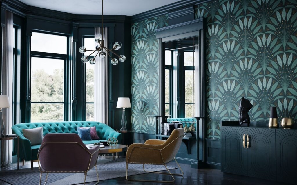
September — Sapphire
A bold, confident blue
Sapphire adds structure and depth. Whether used across an entire room or as a feature wall, it creates a polished, intentional atmosphere. Balance the richness with lighter furnishings and reflective details—glass, metal, or soft textiles—to keep the room feeling open.
October — Opal
A soft neutral with subtle shifts of blush, pearl, and grey
Opal feels calm and quietly elevated. Its gentle color variation makes it ideal for restful spaces, like bedrooms or bathrooms. Keep the palette light with pale woods and warm neutrals, and add mirrors or soft lighting to enhance its natural glow.
November — Gold
A warm, rich metallic
Gold brings drama when used thoughtfully. Let it take center stage in spaces meant to feel bold—entryways, dining rooms, or powder rooms. Ground it with matte black or charcoal finishes and keep metallic accents minimal. Warm lighting makes all the difference here, softening the shine and adding depth.
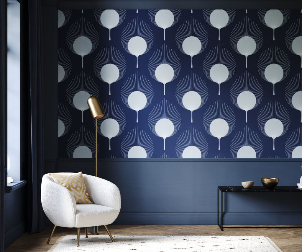
December — Turquoise Blue
A balanced blend of blue and green
Turquoise creates an immersive, story-driven feel. It works best when allowed to remain the focal point, with calm furnishings and layered textures providing balance. Soft linens, velvets, and complementary tones help create a space that feels expressive but grounded.
Sometimes style isn’t about reinventing your home. Sometimes it’s about choosing one color that already belongs to you and letting it quietly shape the months ahead.
Other Topics You Might Like
- Wallpaper Trends for 2026
- 15 Home Decor and Design Trends Millennials Love
- Top Kitchen Design Trends for 2026 You’ll Want to Try
- Ombre Walls: A Stylish Design Trend for 2025
Tamara White is the creator and founder of The Thrifty Apartment, a home decor and DIY blog that focuses on affordable and budget-friendly home decorating ideas and projects. Tamara documents her home improvement journey, love of thrifting, tips for space optimization, and creating beautiful spaces.
- Tamara White
- Tamara White
- Tamara White
- Tamara White
- Tamara White
- Tamara White
- Tamara White
- Tamara White
- Tamara White
- Tamara White
- Tamara White
- Tamara White
- Tamara White
- Tamara White
- Tamara White
- Tamara White
- Tamara White
- Tamara White
- Tamara White
- Tamara White
- Tamara White
- Tamara White
- Tamara White
- Tamara White
- Tamara White
- Tamara White
- Tamara White
- Tamara White
- Tamara White
- Tamara White
- Tamara White
- Tamara White
- Tamara White
- Tamara White
- Tamara White
- Tamara White
- Tamara White
- Tamara White
- Tamara White
- Tamara White
- Tamara White
- Tamara White
- Tamara White
- Tamara White
- Tamara White
- Tamara White
- Tamara White
- Tamara White
- Tamara White
- Tamara White
- Tamara White
- Tamara White
- Tamara White
- Tamara White
- Tamara White
- Tamara White
- Tamara White
- Tamara White
- Tamara White
- Tamara White
- Tamara White
- Tamara White
- Tamara White
- Tamara White
- Tamara White
- Tamara White
- Tamara White
- Tamara White
- Tamara White
- Tamara White
- Tamara White
- Tamara White
- Tamara White
- Tamara White
- Tamara White
- Tamara White
- Tamara White
- Tamara White
- Tamara White
- Tamara White
- Tamara White
- Tamara White
- Tamara White
- Tamara White
- Tamara White
- Tamara White
- Tamara White
- Tamara White
- Tamara White
- Tamara White
- Tamara White
- Tamara White
- Tamara White
- Tamara White
- Tamara White
- Tamara White
- Tamara White
- Tamara White
- Tamara White
- Tamara White
- Tamara White
- Tamara White
- Tamara White
- Tamara White
- Tamara White
- Tamara White
- Tamara White
- Tamara White
- Tamara White
- Tamara White
- Tamara White
- Tamara White
- Tamara White
- Tamara White
- Tamara White
- Tamara White
- Tamara White
- Tamara White
- Tamara White
- Tamara White
- Tamara White
- Tamara White
- Tamara White
- Tamara White
- Tamara White
- Tamara White
- Tamara White
- Tamara White
- Tamara White
- Tamara White
- Tamara White
- Tamara White
- Tamara White
- Tamara White
- Tamara White
- Tamara White
- Tamara White
- Tamara White
- Tamara White
- Tamara White
- Tamara White
- Tamara White
- Tamara White
- Tamara White
- Tamara White
- Tamara White
- Tamara White
- Tamara White
- Tamara White
- Tamara White
- Tamara White
- Tamara White
- Tamara White
- Tamara White
- Tamara White
- Tamara White
- Tamara White
- Tamara White
- Tamara White
- Tamara White
- Tamara White
- Tamara White
- Tamara White
- Tamara White
- Tamara White
- Tamara White
- Tamara White
- Tamara White
- Tamara White
- Tamara White
- Tamara White
- Tamara White
- Tamara White
- Tamara White
- Tamara White
- Tamara White
- Tamara White
- Tamara White
- Tamara White
- Tamara White
- Tamara White
- Tamara White
- Tamara White
- Tamara White
- Tamara White
- Tamara White
- Tamara White
- Tamara White
- Tamara White
- Tamara White
- Tamara White
- Tamara White
- Tamara White
- Tamara White
- Tamara White
- Tamara White
- Tamara White
- Tamara White
- Tamara White
- Tamara White
- Tamara White
- Tamara White
- Tamara White
- Tamara White
- Tamara White
- Tamara White
- Tamara White
- Tamara White
- Tamara White
- Tamara White
- Tamara White
- Tamara White
- Tamara White
- Tamara White
- Tamara White
- Tamara White
- Tamara White
- Tamara White
- Tamara White
- Tamara White
- Tamara White
- Tamara White
- Tamara White
- Tamara White
- Tamara White
- Tamara White
- Tamara White
- Tamara White
- Tamara White
- Tamara White
- Tamara White
- Tamara White