This post may contain affiliate links.

If last year was about playing it safe with soft neutrals, 2026 is shaping up to be about leaning in — gently. Tonal decorating is emerging as a design approach that feels thoughtful rather than showy, expressive without being overwhelming. It’s the interior equivalent of turning the volume up just enough to feel something new, while still staying true to yourself.
What Tonal Decorating Really Means
At its heart, tonal decorating is about committing to one color and letting it lead the conversation. Instead of pairing stark contrasts, the palette unfolds in variations of the same hue, lighter, deeper, muted, and moody tones working together in quiet harmony. Walls, ceilings, skirting boards, and even door frames are no longer treated as separate elements but as part of a single continuous story that wraps around the room.
Rather than relying on stark contrasts or statement shades, tonal decorating is rooted in cohesion. The idea is simple: choose one key color and build outward from it. Lighter and darker variations of the same hue, along with closely related shades, are layered together to create a palette that feels intentional and calm.
By staying within one color family, homeowners can explore depth, mood, and variation without overwhelming the space.
This approach allows rooms to feel expressive while still grounded. Subtle shifts in shade add interest, while the overall palette keeps everything feeling balanced and well considered.
The Middle Ground Between Neutrals and Bold Color
While bold techniques like color drenching have dominated recent design conversations, many homeowners are now searching for something in between. Tonal decorating has emerged as a natural progression, offering more personality than neutral schemes without the intensity of high-impact color.
“Tonal decorating offers a way to move beyond safe neutrals without jumping straight into bold color,” says James Mellan-Matulewicz, Creative Director at Bobbi Beck. “It gives homeowners the confidence to explore a range of shades, creating a look that feels timeless rather than driven by fleeting trends.”
Why Tonal Spaces Feel Calm, Not Flat
One of the biggest misconceptions about tonal decorating is that it risks feeling one-dimensional. In reality, the opposite is often true. Working within a single color palette allows texture, material, and light to take centre stage.
Natural finishes, soft furnishings, and layered fabrics introduce warmth and depth without disrupting the overall flow. Instead of relying on contrast, tonal spaces create interest through nuance, the kind that reveals itself slowly and feels lived in rather than staged.
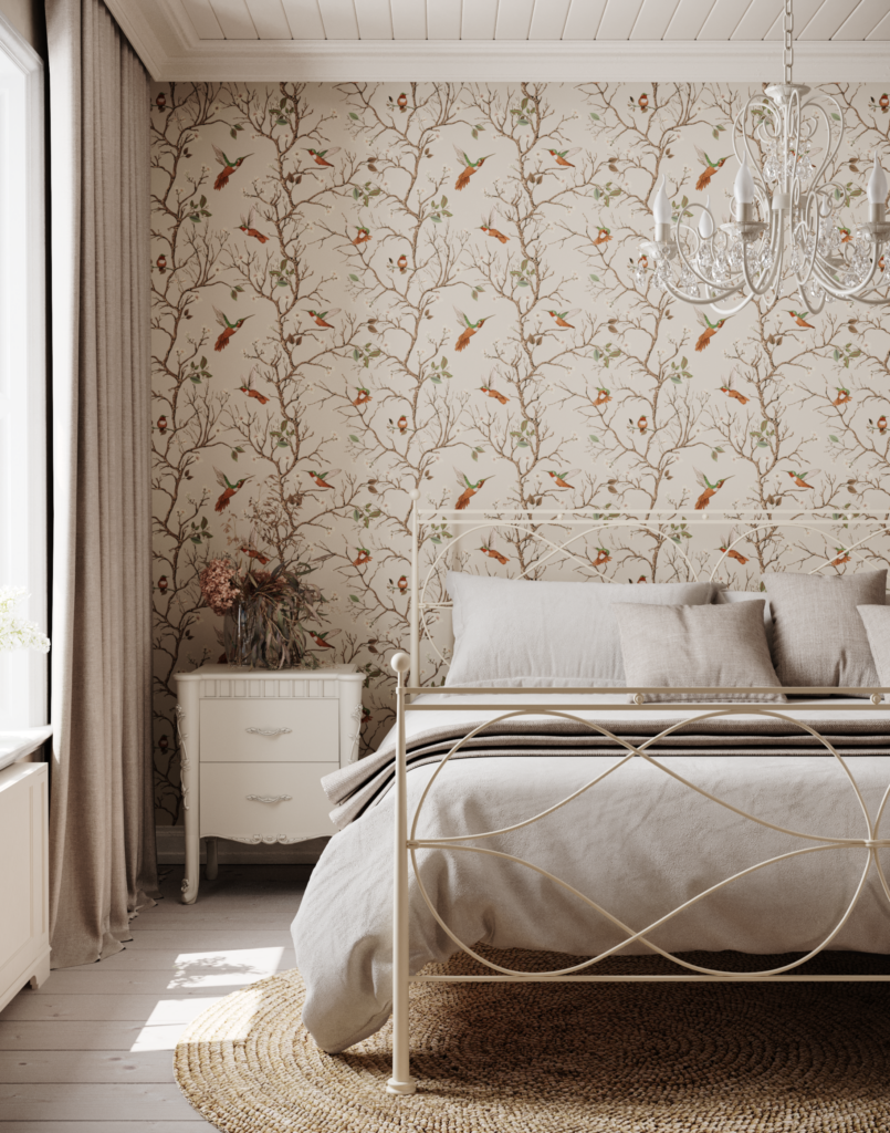
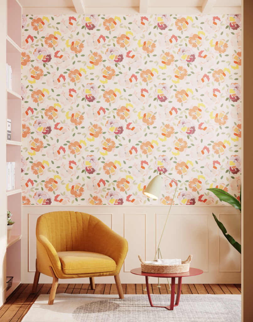
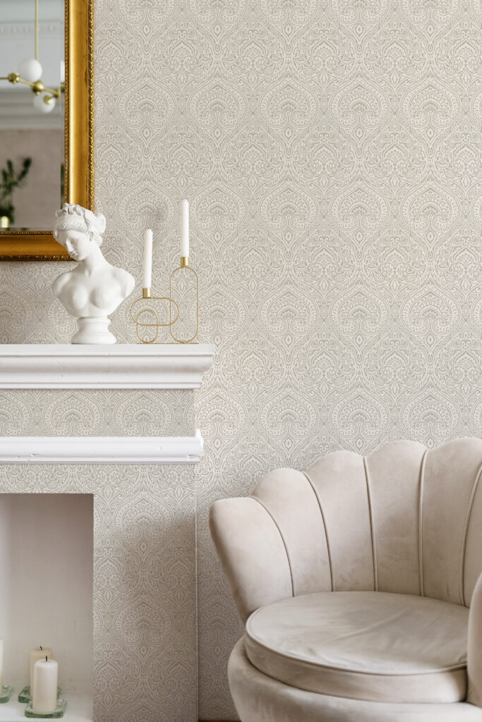
Using Wallpaper as Part of the Color Story
Wallpaper plays a quietly powerful role in tonal interiors when used with intention. Designs that sit within the same color family as the surrounding paint enhance a space rather than dominate it.
Subtle patterned or textured wallpapers can add depth and movement, becoming another layer within the palette. Whether used as a feature wall or wrapped around the room, wallpaper helps create a cohesive, immersive feel.
“Wallpaper plays a key role in tonal schemes when it’s chosen carefully, sitting comfortably alongside painted surfaces,” James explains. “It’s about enhancing the overall look rather than creating contrast, which is why tonal decorating feels so relevant for modern homes.”
The Details That Make Tonal Decorating Work
The success of tonal decorating lies in attention to detail. Consistency of color, thoughtful material choices, and an understanding of how light shifts throughout the day all influence the final result.
When these elements work together, tonal interiors feel effortlessly balanced, elegant without feeling precious, modern without losing warmth.
Why Tonal Decorating Feels Right for 2026
As interior trends continue to move toward more personal, expressive spaces, tonal decorating feels like a natural evolution. It allows homeowners to step away from rigid trends and create rooms that feel intentional, calming, and deeply individual.
Rather than relying on contrast or bold statements, tonal design proves that depth can come from subtlety. In 2026, it’s less about making a statement and more about creating a space that feels like it truly belongs to you.
Other Topics You Might Like
- Wallpaper Trends for 2026
- 15 Home Decor and Design Trends Millennials Love
- Top Kitchen Design Trends for 2026 You’ll Want to Try
- Ombre Walls: A Stylish Design Trend for 2025
Tamara White is the creator and founder of The Thrifty Apartment, a home decor and DIY blog that focuses on affordable and budget-friendly home decorating ideas and projects. Tamara documents her home improvement journey, love of thrifting, tips for space optimization, and creating beautiful spaces.
- Tamara White
- Tamara White
- Tamara White
- Tamara White
- Tamara White
- Tamara White
- Tamara White
- Tamara White
- Tamara White
- Tamara White
- Tamara White
- Tamara White
- Tamara White
- Tamara White
- Tamara White
- Tamara White
- Tamara White
- Tamara White
- Tamara White
- Tamara White
- Tamara White
- Tamara White
- Tamara White
- Tamara White
- Tamara White
- Tamara White
- Tamara White
- Tamara White
- Tamara White
- Tamara White
- Tamara White
- Tamara White
- Tamara White
- Tamara White
- Tamara White
- Tamara White
- Tamara White
- Tamara White
- Tamara White
- Tamara White
- Tamara White
- Tamara White
- Tamara White
- Tamara White
- Tamara White
- Tamara White
- Tamara White
- Tamara White
- Tamara White
- Tamara White
- Tamara White
- Tamara White
- Tamara White
- Tamara White
- Tamara White
- Tamara White
- Tamara White
- Tamara White
- Tamara White
- Tamara White
- Tamara White
- Tamara White
- Tamara White
- Tamara White
- Tamara White
- Tamara White
- Tamara White
- Tamara White
- Tamara White
- Tamara White
- Tamara White
- Tamara White
- Tamara White
- Tamara White
- Tamara White
- Tamara White
- Tamara White
- Tamara White
- Tamara White
- Tamara White
- Tamara White
- Tamara White
- Tamara White
- Tamara White
- Tamara White
- Tamara White
- Tamara White
- Tamara White
- Tamara White
- Tamara White
- Tamara White
- Tamara White
- Tamara White
- Tamara White
- Tamara White
- Tamara White
- Tamara White
- Tamara White
- Tamara White
- Tamara White
- Tamara White
- Tamara White
- Tamara White
- Tamara White
- Tamara White
- Tamara White
- Tamara White
- Tamara White
- Tamara White
- Tamara White
- Tamara White
- Tamara White
- Tamara White
- Tamara White
- Tamara White
- Tamara White
- Tamara White
- Tamara White
- Tamara White
- Tamara White
- Tamara White
- Tamara White
- Tamara White
- Tamara White
- Tamara White
- Tamara White
- Tamara White
- Tamara White
- Tamara White
- Tamara White
- Tamara White
- Tamara White
- Tamara White
- Tamara White
- Tamara White
- Tamara White
- Tamara White
- Tamara White
- Tamara White
- Tamara White
- Tamara White
- Tamara White
- Tamara White
- Tamara White
- Tamara White
- Tamara White
- Tamara White
- Tamara White
- Tamara White
- Tamara White
- Tamara White
- Tamara White
- Tamara White
- Tamara White
- Tamara White
- Tamara White
- Tamara White
- Tamara White
- Tamara White
- Tamara White
- Tamara White
- Tamara White
- Tamara White
- Tamara White
- Tamara White
- Tamara White
- Tamara White
- Tamara White
- Tamara White
- Tamara White
- Tamara White
- Tamara White
- Tamara White
- Tamara White
- Tamara White
- Tamara White
- Tamara White
- Tamara White
- Tamara White
- Tamara White
- Tamara White
- Tamara White
- Tamara White
- Tamara White
- Tamara White
- Tamara White
- Tamara White
- Tamara White
- Tamara White
- Tamara White
- Tamara White
- Tamara White
- Tamara White
- Tamara White
- Tamara White
- Tamara White
- Tamara White
- Tamara White
- Tamara White
- Tamara White
- Tamara White
- Tamara White
- Tamara White
- Tamara White
- Tamara White
- Tamara White
- Tamara White
- Tamara White
- Tamara White
- Tamara White
- Tamara White
- Tamara White
- Tamara White
- Tamara White
- Tamara White
- Tamara White
- Tamara White
- Tamara White
- Tamara White
- Tamara White
- Tamara White
- Tamara White
- Tamara White
- Tamara White
- Tamara White
- Tamara White
- Tamara White
- Tamara White
- Tamara White
- Tamara White
- Tamara White
- Tamara White